
Lindsay and I want to thank her brother, Charlie, for designing both our original logo (v1.0), and our new and improved logo (v2.0).
When we decided to start this blog we gave him a few thoughts and sample images with styles that we liked. Our initial thoughts were limited to what, in retrospect, is really “font-art” (e.g., Google’s ever-changing images that all depict the word “Google”). We weren’t really thinking about a real “logo”.
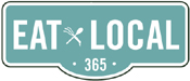
This is where Charlie’s background in advertising came in handy. The Eat Local “street sign” was his idea, which we loved because it conveys a “sense of place”. Local eating is about eating what is available near you at any given time of year. Buy from nearby. Helping people deal with the challenges of locality and seasonality in cooking is the reason we started this blog.
In version 2.0 of our logo, Charlie tweaked the style a bit. He also came up with a “mark” for us: the crossed hand rake and spoon. It works very well visually within the logo. We can use it in places where we can’t fit the logo, such as for a watermark or as our “favicon” (the tiny icon at the top of your browser window).
Best of all, Charlie’s design for the mark extends the theme of the logo, representing the connection between the farm and the kitchen. Many stylish, locally-sourced restaurants promote themselves as being “farm to table”; this is our version.
Thanks, Charlie! The logo looks great, and it sends a message – twice – about our mission.
The man’s got advertising talent. Beware his TV spots!